Understanding IoT Data Visualization: Unravelling the Power of Data
The Internet of Things (IoT) has become integral to our tech-savvy lives. With the increasing interconnectivity of devices and objects, IoT dashboards generates vast amounts of data that hold immense potential for enhancing our understanding of the world around us.
Here are some interesting statistics about IoT:
- According to a report by Statista, the number of Internet of Things (IoT) connected devices worldwide is projected to grow significantly, reaching 30.9 billion devices by 2025.
- A McKinsey Global Institute report estimated that the total economic impact of IoT applications across various industries could range from $3.9 trillion to $11.1 trillion annually by 2025.
We rely on IoT data visualization to make sense of this data, which helps transform complex information into clear and meaningful visuals.
What to expect: This article aims to shed light on IoT data visualization and its importance in harnessing the power of IoT-generated data.
Understanding IoT Data Visualization
Data visualization represents information through visual elements like charts, graphs, and diagrams. Its primary purpose is to present data in a format that is easy to comprehend, allowing individuals to quickly identify patterns, trends, and insights.
By translating raw data into visual form, data visualization enables us to make informed decisions, solve problems, and communicate complex ideas efficiently.
IoT Data Visualization
IoT data visualization involves the graphical representation of data collected from IoT devices and systems. These devices, equipped with sensors and connectivity, continuously gather information from the surrounding environment. Their data may include temperature, humidity, pressure, location, etc.
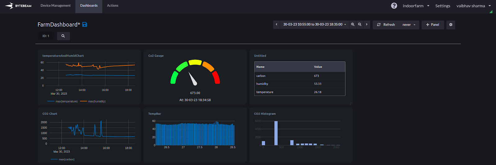
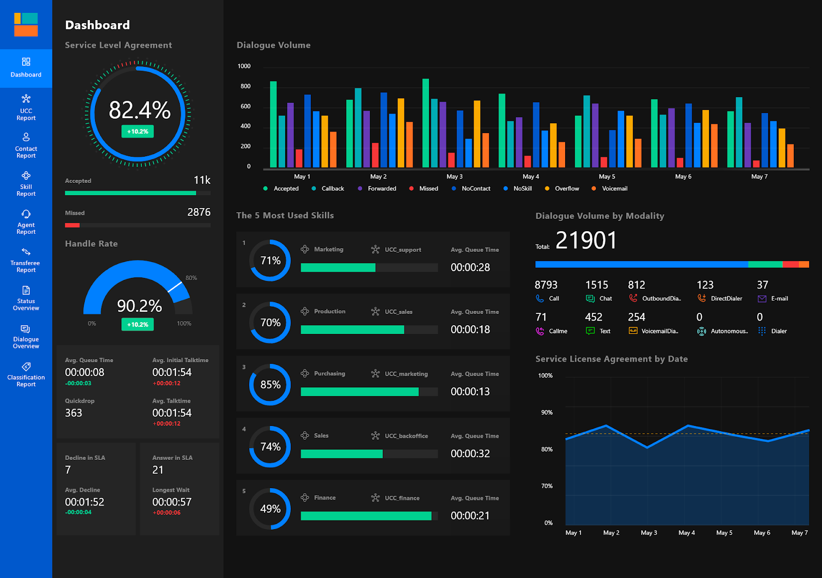
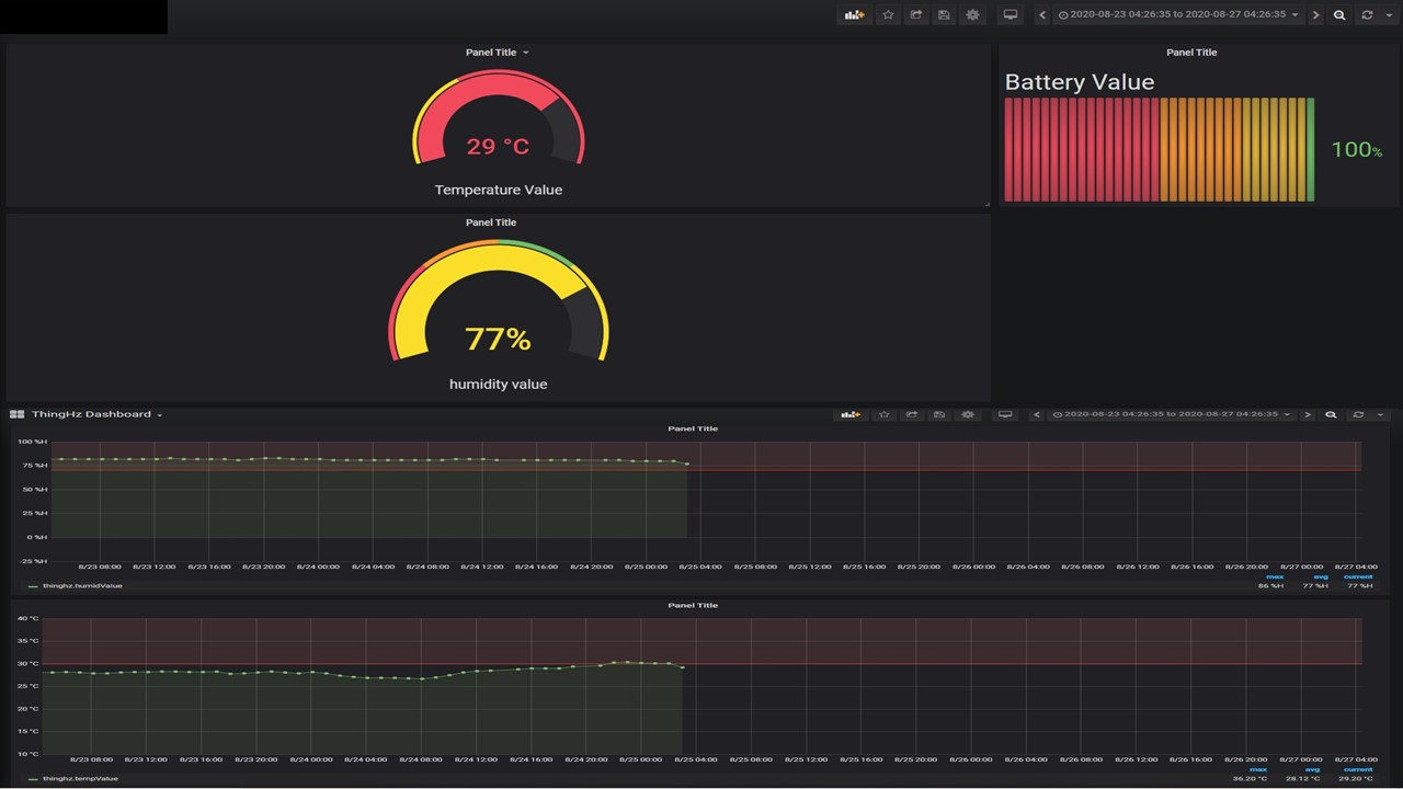
However, this data can be overwhelming and challenging to analyze when left in its raw form. Here is a quick look at the data visualization dashboard containing different IoT dashboards with visualization panels.
Similarly, IoT data visualization uses intuitive charts, maps, and graphs to simplify the complexity of IoT-generated data, making it easier for users to grasp valuable insights. By visualizing the data, we can uncover patterns and relationships that might have remained hidden in a sea of numbers.
Role of IoT in Generating Vast Amounts of Data
The IoT is at the heart of the data revolution. The interconnectedness of various smart devices, such as smartphones, smartwatches, home automation systems, and industrial sensors, results in a constant stream of data. These devices exchange information with each other and with cloud-based platforms, generating enormous volumes of data in real-time.
Importance of Visualizing IoT Dashboards
The value of data lies in its ability to inform and guide decision-making. However, with the sheer volume of data generated by IoT devices, processing and comprehending it in its raw form becomes daunting. This is where IoT data visualization proves its worth.
- Simplifies Complex Data: IoT data visualization simplifies intricate data sets, making them accessible even to individuals without a technical background. Using visuals like line graphs to display changes over time or pie charts to represent proportions makes it easier to grasp the overall picture.
- Identifies Anomalies and Patterns: Visualizing IoT data allows us to identify anomalies, outliers, and patterns that might not be apparent when examining raw numbers. Trends and irregularities in data can be quickly spotted, enabling prompt actions or interventions.
- Facilitates Decision-making: When data is presented visually, decision-makers can quickly understand and analyze the information. This empowers them to make timely and well-informed choices, whether in businesses optimizing their operations or individuals managing their daily lives.
- Enhances Communication: Visualization of IoT data enhances communication and collaboration among teams and stakeholders. It enables the effective sharing of insights and findings, leading to better problem-solving and improved outcomes.
Benefits of IoT Data Visualization
Here are some key benefits of IoT data visualization.
Enhanced Understanding of Complex IoT Data
IoT devices produce immense data, often containing intricate relationships and interdependencies. IoT data visualization simplifies this complexity by presenting the data visually. Using clear and concise charts, graphs, and other visuals makes it easier for users to comprehend the data's nuances and gain a deeper understanding of the underlying trends and insights.
Real-time Monitoring and Analysis
IoT data visualization enables real-time monitoring of data streams. As IoT devices continuously generate data, it is essential to have up-to-date information readily available. Through interactive dashboards and live charts, decision-makers can monitor the status of various IoT parameters in real time, facilitating immediate responses to changing conditions.
Improved Decision-making Processes
Quickly grasping and interpreting data empowers decision-makers to make informed choices. IoT dashboards provides a clear picture of the current situation and the impact of potential decisions. This leads to more effective and timely decision-making, whether optimizing processes, managing resources, or addressing critical issues.
Identifying Patterns, Trends, and Anomalies
Patterns and trends in IoT data may not always be evident when examining raw data. Visualization tools like line charts, bar graphs, and heatmaps make identifying patterns and detecting anomalies easier. Organizations can proactively respond to emerging opportunities or mitigate potential risks by spotting trends early on.
Predictive Insights and Forecasting
IoT dashboards helps analyze historical data and facilitates predictive insights and forecasting. Machine learning algorithms can identify potential future scenarios by applying advanced analytics to visualized data—these predictive insights aid businesses and individuals in making proactive decisions and planning for the future.
Techniques and Tools for IoT Data Visualization
Let’s take a quick look at some prominent visualization techniques:
- Line Charts: Line charts display trends over time, making them ideal for visualizing continuous data, such as temperature fluctuations or sensor readings.
- Bar Graphs: Bar graphs compare different categories or discrete data points. They help represent data such as the number of IoT devices deployed in various locations.
- Pie Charts: Pie charts display the proportions of a whole. They help illustrate the distribution of IoT data in different categories.
- Scatter Plots: Scatter plots depict the relationship between two variables, showing how they correlate. This technique is valuable for identifying connections between IoT parameters.
- Heatmaps: Heatmaps use colors to represent data density on a map or grid. They help visualize data trends geographically, like variations in temperature across different regions.
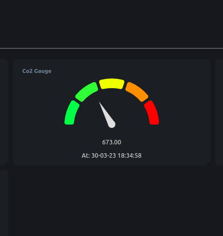
- Gauge Charts: Gauge charts represent a single value within a specific range, often used to display real-time data, such as battery levels or system health.
- Interactive IoT Dashboards: Dashboards are a collection of visualizations providing a comprehensive view of multiple IoT data metrics. Users can interact with the dashboard to explore and analyze real-time data.
- Geographic Information Systems (GIS): GIS technology integrates IoT data with geographic locations, allowing visualization of IoT data on maps. This is especially useful for tracking vehicle movements or environmental monitoring applications.
Popular Tools for IoT Data Visualization
When visualizing the vast amounts of data generated by the Internet of Things (IoT), several powerful tools have gained popularity. These tools offer user-friendly interfaces and robust capabilities that enable individuals and organizations to transform complex IoT data into meaningful and insightful visuals.
There are two distinct categories of tools that have garnered popularity, these include:
- Out of the Box Tools: They are readily available and have user-friendly interfaces and powerful functionalities. They empower users to convert intricate IoT data into meaningful and insightful visuals with relative ease.
Few examples of out of the box tools include:
- Tableau
- Power BI
- Grafana
- ThingSpeak
- Ubidots
- Build Your Own Solutions: They encompass libraries that allow developers to create customized data visualization tools like the ones mentioned above. These libraries provide the necessary building blocks and functionalities to design tailored solutions specific to the requirements of individual users or organizations.
Few examples of build your own solutions include:
- D3.js (Data-Driven Documents)
- Plotly
- Chart.js
- Matplotlib
- Bokeh
- Highcharts
Here are five popular tools for IoT data visualization:
Bytebeam
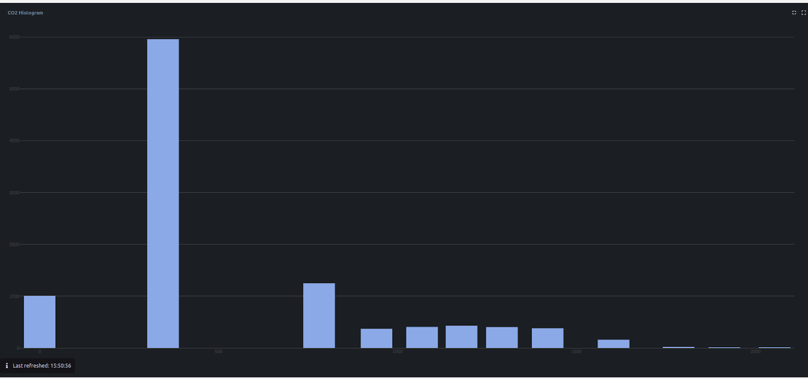
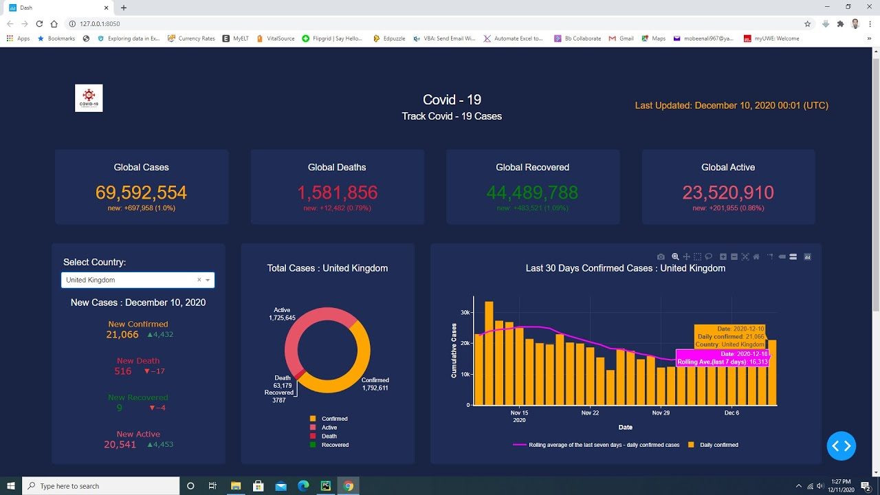
Bytebeam IoT platform offers a user-friendly and intuitive interface, making it easy for users to connect their ESP32 Arduino devices and visualize their IoT data in real time. Here is a quick example of how you can visualize data with Bytebeam:
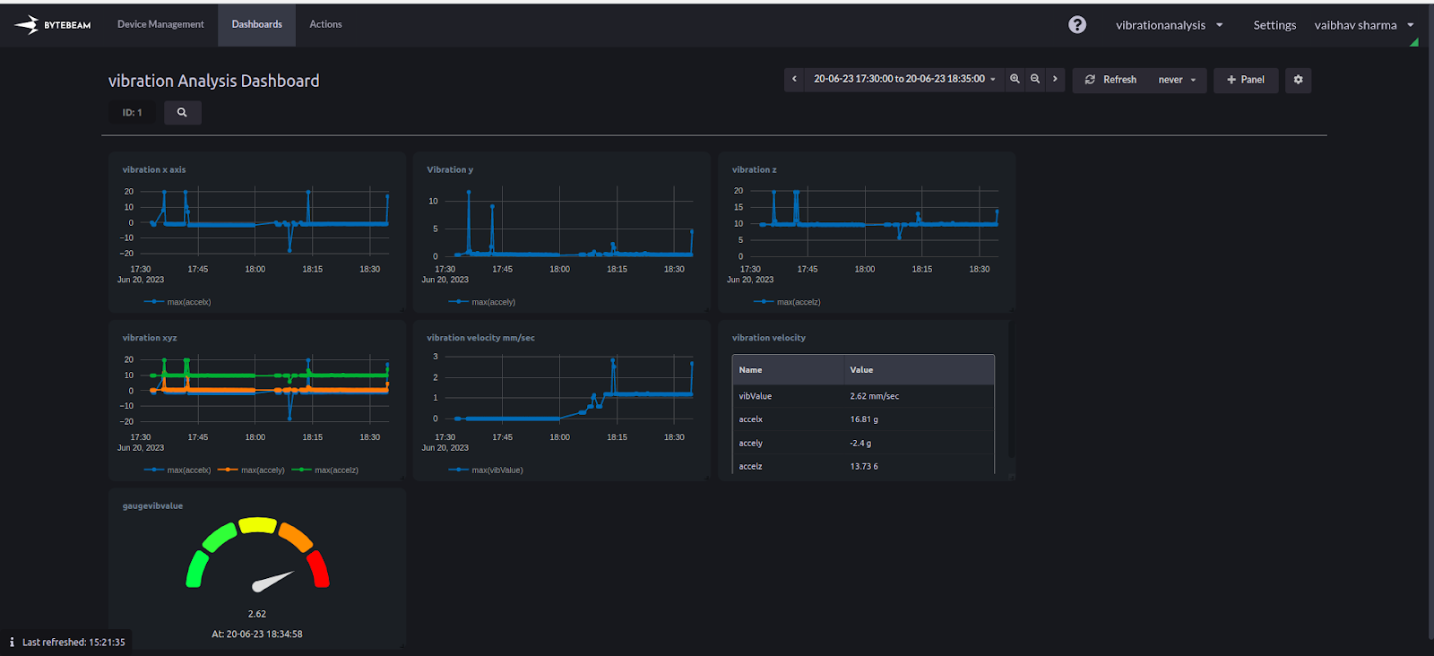
Bytebeam platform's versatility allows it to support various data sources, enabling users to integrate data from sensors, actuators, and other IoT devices effortlessly.
Amazon Quick Sight
Amazon QuickSight is a business intelligence (BI) tool and data visualization service offered by Amazon Web Services (AWS). It enables users to create interactive, insightful dashboards and reports from various data sources.
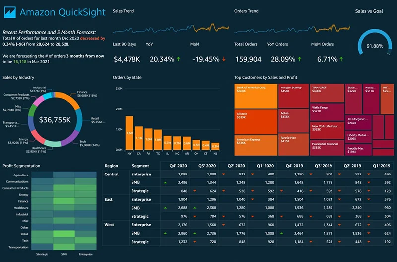
QuickSight simplifies the process of analyzing large datasets, making it easier for businesses to gain valuable insights and make data-driven decisions. It supports various data formats and offers various visualization options, making it a powerful tool for data exploration and analysis.
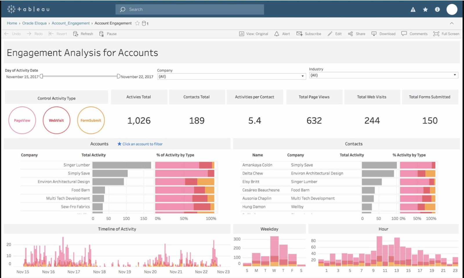
Tableau
Tableau has emerged as a leading data visualization tool, revered for its user-friendly interface and powerful capabilities. This software has revolutionized how data is visualized and analyzed, empowering beginners and experienced analysts to gain valuable insights from their datasets.
Power BI
Developed by Microsoft, Power BI is another popular tool for IoT data visualization. It seamlessly integrates with other Microsoft products, making it a preferred choice for organizations using Microsoft's ecosystem.
Power BI offers a wide range of visualization options, and its real-time capabilities allow users to monitor and analyze IoT data as it streams in, ensuring quick and informed decision-making.
D3.js
D3.js is a JavaScript library that provides a robust framework for creating interactive and custom data visualizations on the web. While it requires more technical expertise than other tools, D3.js offers unparalleled flexibility and control over the visual representation of data.
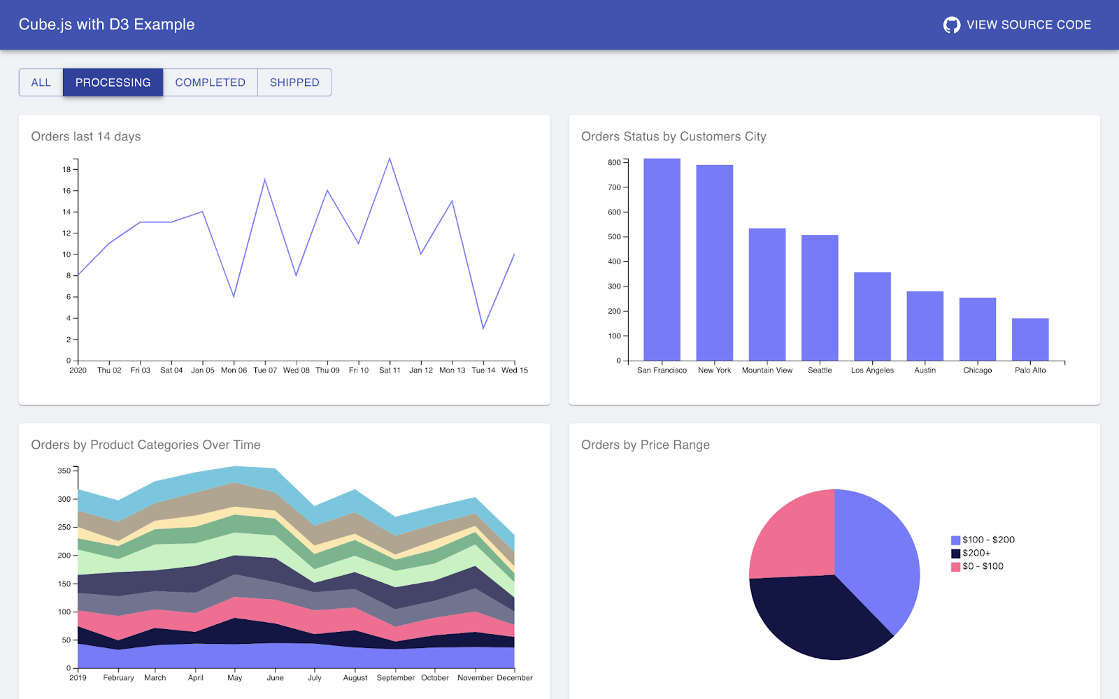
It is often chosen by developers and data scientists who want to build highly customized and visually stunning IoT data visualizations.
Plotly
Plotly is a user-friendly data visualization library that supports multiple programming languages, including Python, R, and JavaScript. It offers various chart types and interactive features, making it a popular choice for IoT data visualization.
Plotly's visualizations are aesthetically pleasing and highly informative, allowing users to dig deep into the data for meaningful insights.
Grafana
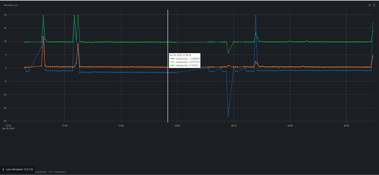
Grafana is an open-source platform designed specifically for time-series data visualization, making it an excellent fit for IoT data. It supports integration with various data sources and provides a range of pre-built visualizations and the option to create custom panels.
Grafana's real-time monitoring capabilities and alerting features make it a preferred tool for visualizing and managing IoT data in real time.
Note: Each tool offers distinct features and advantages, catering to user needs and preferences. Whether you're a data analyst, business user, or developer, these popular tools empower you to harness the power of IoT data visualization and uncover valuable insights to drive informed decisions and maximize the potential of the Internet of Things.
Challenges and Considerations in IoT Data Visualization
IoT data visualization offers valuable insights and benefits but has its fair share of challenges and considerations. Addressing these challenges is crucial to ensure accurate and meaningful interpretations of the data.
Handling Large Volumes of Data
The sheer volume of data IoT devices can overwhelm traditional data visualization tools and systems. Managing and processing massive datasets requires robust infrastructure and optimized algorithms to ensure smooth visualization and analysis.
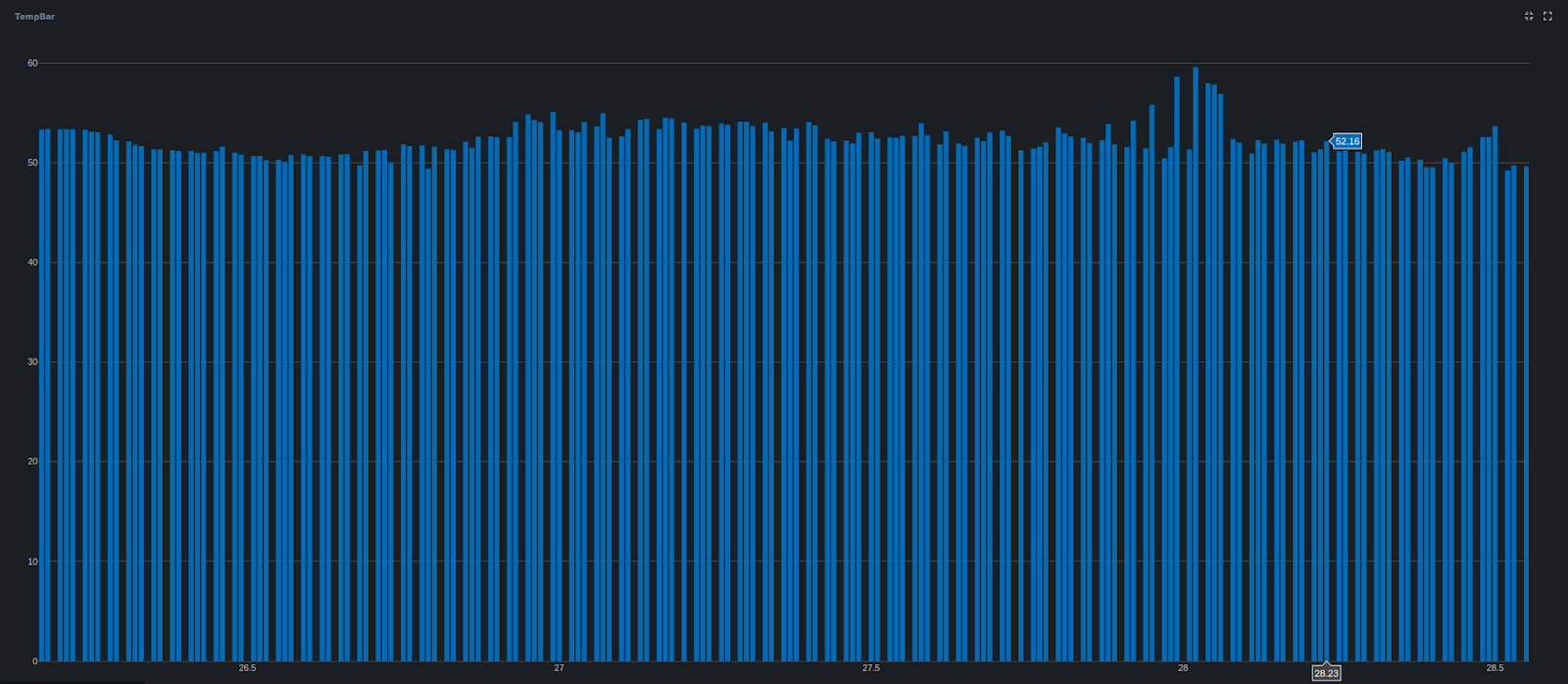
For example, using a line chart to display a large volume of data can lead to system hang-ups when dealing with data from IoT devices. So, traditional data visualization tools may need help to handle the overwhelming amount of information.
You can address this issue by incorporating features like displaying an overall trendline and providing a way to zoom in for detailed analysis. This ensures a smoother visualization and analysis process, requiring robust infrastructure and optimized algorithms capable of effectively managing and processing massive datasets.
Ensuring Data Security and Privacy
IoT data often contains sensitive information, so ensuring data security and privacy is paramount. Unauthorized access to IoT data can have severe consequences, making it essential to implement strong encryption, access controls, and secure data transmission protocols.
For example, role-based access tools can enhance data security and privacy in IoT environments. IoT data contains sensitive information, and unauthorized access could lead to severe consequences. By enforcing role-based access control, the system can ensure that only authorized individuals or entities can access specific data, reducing the risk of data breaches and unauthorized use of sensitive information.
Dealing with Data Variety and Complexity
IoT data comes in various formats, including structured, semi-structured, and unstructured. Additionally, data from different IoT devices may have varying levels of complexity. Visualization tools must effectively handle this data diversity and complexity to provide accurate insights.
Choosing the Right Visualization Approach for Specific Data Types
Not all data visualization techniques are suitable for every type of IoT data. Some data types may require specific visualization approaches to best represent the information. Selecting the appropriate visualization technique is critical for obtaining meaningful insights from the data.
Use Cases of IoT Data Visualization
- Smart Cities and Urban Planning: IoT data visualization plays a significant role in innovative city initiatives, where data from various sources, such as traffic sensors, weather stations, and surveillance cameras, are collected and analyzed. By visualizing this data, city planners can optimize traffic flow, manage resources efficiently, and enhance urban living.
- Industrial IoT and Predictive Maintenance: In industrial settings, IoT devices monitor equipment health, collect sensor data, and identify potential issues before they escalate into costly failures. IoT data visualization aids in predicting maintenance needs, optimizing machinery performance and minimizing downtime, leading to improved productivity and reduced operational costs.
- Healthcare and Remote Patient Monitoring: IoT devices in healthcare, such as wearable health trackers and remote monitoring sensors, generate vast amounts of patient data. By visualizing this data, healthcare professionals can closely monitor patients' health, detect anomalies, and deliver personalized care, even from a distance.
Wrapping Up
IoT data visualization is a powerful technique that transforms the vast amounts of data generated by the Internet of Things into clear and insightful visuals. Using various visualization techniques like charts, graphs, and maps simplifies complex data, enabling individuals and organizations to understand trends, patterns, and anomalies better.
Through IoT data visualization, businesses can identify inefficiencies, predict maintenance needs, optimize processes, and deliver personalized customer service. In healthcare and environmental monitoring sectors, it empowers professionals to improve patient care and address critical environmental challenges. Furthermore, it fosters collaboration and communication by enabling stakeholders to share and understand data.
Potential Future Developments in IoT Data Visualization:
As technology continues to evolve, so will IoT data visualization. Future developments might include more advanced AI-driven analytics to identify subtle patterns and predict outcomes more accurately. Additionally, with the growing popularity of augmented and virtual reality, IoT dashboards can be incorporated into immersive environments, providing new ways to explore and interact with data.
Furthermore, advancements in edge computing will enable real-time data visualization closer to the data sources, reducing latency and enhancing responsiveness. This will be especially crucial in applications requiring immediate decisions, such as autonomous vehicles or emergency response systems.
Unleash the Power of Data Visualization with Bytebeam
Bytebeam's data visualization capabilities open a world of possibilities for IoT enthusiasts and businesses seeking to harness the true potential of their data. With real-time insights, customization options, and top-notch security measures, our platform empowers users to make data-driven decisions, optimize operations, and succeed in the rapidly evolving IoT landscape.
As an IoT platform, Bytebeam offers you the following capabilities:
- Real-Time Insights: Bytebeam's data visualization allows users to monitor and analyze IoT data using interactive dashboards, graphs, and charts. This enables quick identification of patterns, trends, and anomalies, allowing prompt and data-driven decision-making for process optimization and adapting to changing conditions.
- Customization and Flexibility: Bytebeam's platform offers high customization, allowing users to choose from visualization techniques like line charts, bar graphs, and scatter plots to represent their unique IoT data. Users can design custom dashboards tailored to their specific needs.
- Data Security and Privacy: Data security is a top priority at Bytebeam. Robust encryption and access controls ensure continuous protection of IoT data. Industry best practices are followed to safeguard sensitive information, providing users with peace of mind.
- Seamless Integration: Bytebeam's data visualization seamlessly integrates with ESP32 Arduino devices, simplifying IoT device connectivity. Step-by-step guides and tutorials facilitate the quick setup of data streams for instant visualization of IoT data.
To learn more about our data visualization capabilities and get started with ESP32 Arduino and Bytebeam, visit our website and take the first step towards a more innovative, more connected world.


